
New CRMX Button Hover Animations: Make CTAs Feel Responsive
CRMX now gives website and funnel buttons a customizable library of hover effects. Learn where to use them, how to tune them, and what to test.
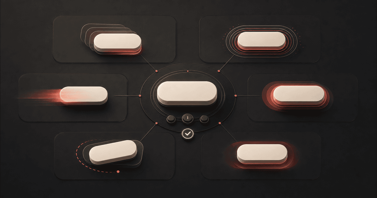
CRMX website and funnel buttons can now respond with customizable hover effects. Instead of writing CSS for a button interaction, you can choose an effect in the Page Builder, preview it on the canvas, and adjust the timing and appearance from the sidebar.
The official release notice, published July 31, 2026, presents this as a current release. It does not list a beta flag, Labs requirement, phased schedule, regional restriction, agency-only limitation, or plan restriction.
This is a design improvement, not a conversion guarantee. A good hover state can make a desktop button feel responsive and clearly interactive. A distracting one can compete with the offer. The useful question is not “Which animation looks the coolest?” It is “Which small signal helps the visitor understand the next action?”
What changed in CRMX
The button editor now includes an expanded hover-animation library organized into six groups:
- Scale: effects such as Grow, Shrink, Pulse, and Bounce In.
- Rotation: Rotate and Skew Forward.
- Movement: Float, Wobble Horizontal, and Buzz.
- Background: directional and radial color transitions.
- Border: effects including Ripple Out, Outline In, and Underline From Center.
- Shadow: Shadow, Glow, and Box Shadow Outset.
You can hover over an effect card in the builder to preview it before selecting it. After selection, every effect exposes the same core controls:
- duration from 0.1 to 3 seconds;
- delay from 0 to 5 seconds;
- Linear, Ease-in, Ease-out, or Ease-in-out timing.
CRMX then shows only the adjustment controls relevant to that effect. Depending on the category, those controls can include scale, angle, movement distance, fill color, border color and thickness, or shadow color, blur, and spread.
The release also addresses several interaction details:
- Hover effects automatically switch off on touch devices and screens below 1024 pixels.
- If a button also has an entrance animation, the hover effect waits for the entrance to finish.
- Replicated buttons, including sticky-bar and navigation copies, mirror the original button's hover behavior.
- Entrance animations wait until content is visible and no longer replay simply because a builder component remounts.
The official animation guide confirms the Page Builder workflow, live preview, timing controls, and no-code adjustment panel.
Why this matters operationally and financially
Before this release, a designer who wanted a more specific hover treatment often had to add and maintain custom CSS. That creates another detail to document, test, and protect when a page or template changes.
The new controls can reduce that maintenance burden:
- Faster page finishing: Apply and preview an interaction without leaving the builder.
- More consistent design: Reuse the same restrained behavior across matching primary or secondary buttons.
- Less custom code: Keep common motion settings in the visual editor instead of a separate CSS layer.
- Clearer desktop feedback: Give mouse and trackpad users an immediate signal that a button is interactive.
The financial value is operational. A team may spend less design and development time creating common button states, while clearer interaction feedback may support a better page experience. The release does not promise more clicks, leads, bookings, or revenue. Measure those outcomes on the page rather than assuming the animation caused them.
Who benefits most
This update is especially useful for:
- home-service companies building estimate, inspection, service, or seasonal-offer pages;
- coaches and consultants launching applications, workshops, webinars, or consultation funnels;
- small teams that want polished interactions without a custom front-end developer;
- agencies and operators maintaining reusable CRMX page templates;
- designers who want consistent button behavior across pages and sticky navigation.
It matters less on mobile-only traffic because hover interactions are intentionally disabled for touch devices and screens below 1024 pixels. The button still needs to look clickable without motion.
The CRMX motion-with-purpose method
Use motion as feedback, not decoration. This five-step method keeps the interaction tied to the visitor's decision.
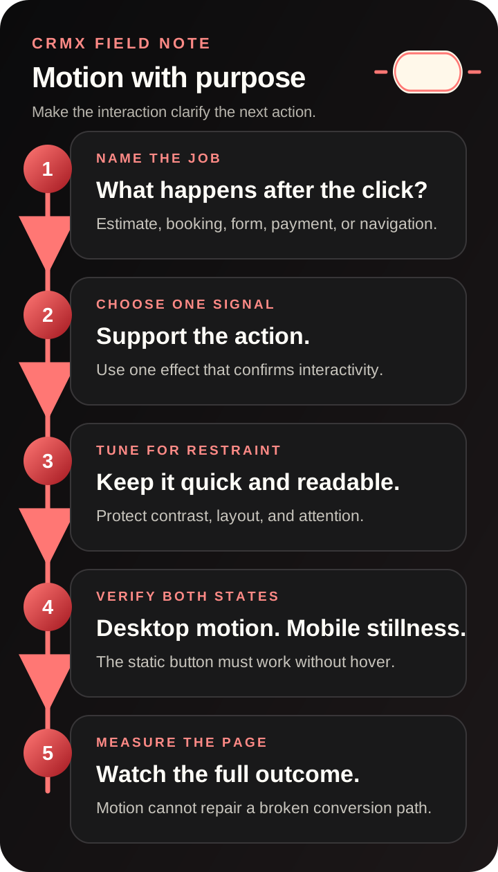
1. Name the button's job
Decide what the button actually does: request an estimate, book a consultation, continue a form, submit payment, open navigation, or reveal more information.
A primary conversion button needs confidence and clarity. A secondary navigation button should stay quieter. Do not start by browsing effects; start by naming the action.
2. Choose one useful signal
Match the effect to the job. A slight grow, clean outline, subtle background sweep, or restrained shadow can confirm interactivity without becoming the main event.
Reserve pulse, buzz, wobble, and larger rotation effects for rare situations where that energy fits the brand and message. Repetition turns emphasis into noise.
3. Tune for restraint
Start with a short duration, no delay, and a modest visual change. The control should react promptly to the visitor's pointer, not perform a long sequence.
Check that the effect does not shift nearby content, reduce text contrast, hide the button label, or make the button feel unstable.
4. Verify desktop and mobile separately
Preview the hover state on desktop, then inspect the same page at mobile width. CRMX disables hover behavior on touch devices and below 1024 pixels, so the static mobile button must still have adequate contrast, size, spacing, and a clear label.
Also verify keyboard focus independently. Hover and focus are different states, and mouse feedback should not replace an accessible focus indicator.
5. Measure the page, not the effect
Publish the change, confirm the live interaction, and watch the page's real conversion path. If you compare versions, change one meaningful variable at a time. A hover effect cannot repair a weak offer, unclear headline, slow page, broken form, or confusing next step.
Example 1: a home-service estimate page
An HVAC company has a primary Request My System Check button near the top of a seasonal landing page and a matching sticky button after the visitor scrolls.
The operator selects a restrained background sweep, uses the brand's existing button colors, and keeps the transition short. CRMX applies the hover behavior to the replicated sticky button as well.
The team then checks three things:
- The desktop label remains readable throughout the color transition.
- The sticky copy behaves like the original button.
- The mobile button still looks complete when hover motion is disabled.
The animation supports the existing action. The home-service lead qualification process still determines whether the inquiry reaches the right booking or human follow-up path.
Example 2: a coach or consultant application funnel
A business coach uses a See If the Program Fits button on a workshop page. The button leads to a short application rather than an immediate purchase.
A small outline or shadow effect can give desktop visitors responsive feedback without adding fake urgency. The coach uses the same treatment on other application buttons but keeps course-navigation and footer links visually quieter.
After publishing, the team verifies the button destination, application flow, mobile layout, and follow-up ownership. For the system behind that page, see the CRMX SIGNAL Loop for coaching lead magnets.
How to add a hover animation in CRMX
Use this sequence inside a CRMX Website or Funnel:
- Open Sites and choose the Website or Funnel.
- Open the page in the Page Builder.
- Select the button on the canvas.
- Open the Animation tab in the sidebar.
- Choose Hover Animation.
- Hover over effect cards to preview them on the selected button.
- Select one effect.
- Use the Adjust panel to tune duration, delay, easing, and any effect-specific controls.
- Preview the page at desktop and mobile widths.
- Publish, then test the live page and its destination.
If the button already has an entrance animation, confirm the complete sequence. The hover effect is designed to wait until the entrance animation finishes.
Limitations and rollout notes
Keep these boundaries in view:
- Hover is a desktop interaction. CRMX disables it on touch devices and screens below 1024 pixels.
- The static button must stand on its own. Mobile visitors should not need motion to recognize the action.
- One animation does not fix the conversion path. Copy, offer clarity, load speed, form behavior, routing, and follow-up still matter.
- Preview is not production QA. Test the published page, destination, sticky copies, and relevant browsers.
- Motion can create accessibility friction. Avoid aggressive movement, long delays, flashing, and effects that weaken focus visibility or text contrast.
- The official release count is internally inconsistent. Its summary says 21 built-in effects, while the itemized categories name 20. This article avoids relying on the disputed count; use the current effect grid in your CRMX builder as the operational source of truth.
- The release does not state restricted availability. The official notice lists no beta, Labs, phased, regional, agency-only, or plan limitation as of July 31, 2026.
Button-motion QA checklist
Before publishing:
- Name the action the button completes.
- Choose one effect that supports that action.
- Keep the duration short and the visual change restrained.
- Confirm the label remains readable through every state.
- Check that the effect does not move surrounding content.
- Verify the entrance and hover sequence when both are enabled.
- Inspect the static button below 1024 pixels.
- Confirm keyboard focus remains obvious.
After publishing:
- Test the live hover interaction with a mouse or trackpad.
- Test the live destination, form, calendar, or checkout.
- Check original and replicated buttons.
- Recheck mobile spacing, contrast, and tap target.
- Record the standard effect used for matching buttons.
- Measure the full page outcome before keeping or expanding the treatment.
For the wider page system, read How to Build an AI-First Website That Converts Leads.
Where this fits in the CRMX lead-to-customer system
Button hover animations improve the interaction layer before a lead enters the system. They do not change how a form captures data, how a calendar books an appointment, how a workflow follows up, or how a CRMX AI employee qualifies a conversation.
The useful connection is sequential: a clear page helps the visitor choose the next step; the CRMX platform then carries that response through the inbox, pipeline, calendar, workflow, and customer record. Use motion to support the click, then make sure the system behind the click is ready.
Frequently asked questions
Do I need custom CSS to add these button hover effects?
No. The release adds effect selection, live preview, and adjustment controls directly in the CRMX Page Builder.
Do hover animations run on mobile?
No. The official release says they automatically switch off on touch devices and screens below 1024 pixels to prevent stuck hover states.
Can I adjust the speed of the effect?
Yes. The shared controls include duration from 0.1 to 3 seconds, delay from 0 to 5 seconds, and four easing choices. Additional controls depend on the selected effect.
What happens if the button also has an entrance animation?
The hover effect waits until the entrance animation finishes before it becomes active.
Will hover animation increase conversions?
Not automatically. It can provide clearer interaction feedback, but the release makes no performance promise. Test the full page and conversion path.
Which hover effect should I use for a primary CTA?
Start with a restrained effect that preserves readability and layout, such as a slight scale change, clean outline, modest background transition, or subtle shadow. Brand fit and page context matter more than novelty.
Make the button respond, then verify what happens next
Start with one important desktop CTA. Name its job, apply one restrained effect, inspect the mobile fallback, publish, and test the complete destination.
If you want help connecting the page, form, calendar, follow-up, AI employee, and reporting into one lead-to-customer system, explore CRMX services.